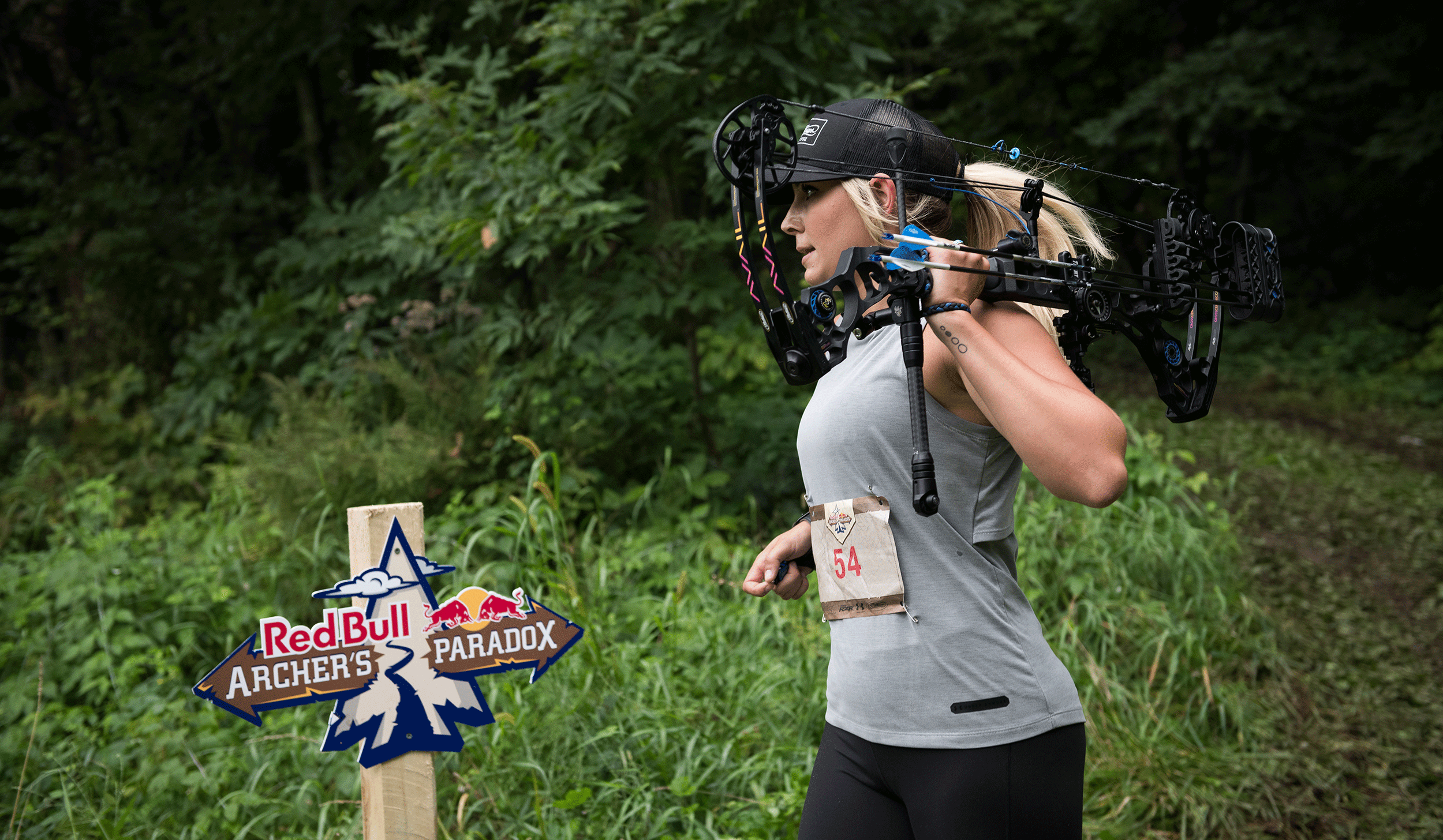
Red Bull Archer's Paradox
Red Bull wanted to create a biathlon style event that took place in the summer. They wanted one that incorporated cross-country running and archery as opposed to it’s winter counterparts cross-country skiing and rifle shooting. From there, Archer’s Paradox was born. Contestants would race through wooded terrain, stopping at points along the way to show off their archery skills on various targets.
Agency: SixSpeed / Creative Direction: Matt Brickner / Role: Designer
Photos courtesy of Red Bull Content Pool.


The inspiration for the logo came from the weathered wooden trail signs that are seen on many trails and hiking paths. The original concept had a circular, rough-hewn section of log as the center of the mark and acting as a “target” for the archers, with the trail signs erupting from its sides. From there the mark evolved to one that told more of a story and one that encompassed the spirit of the event.


